
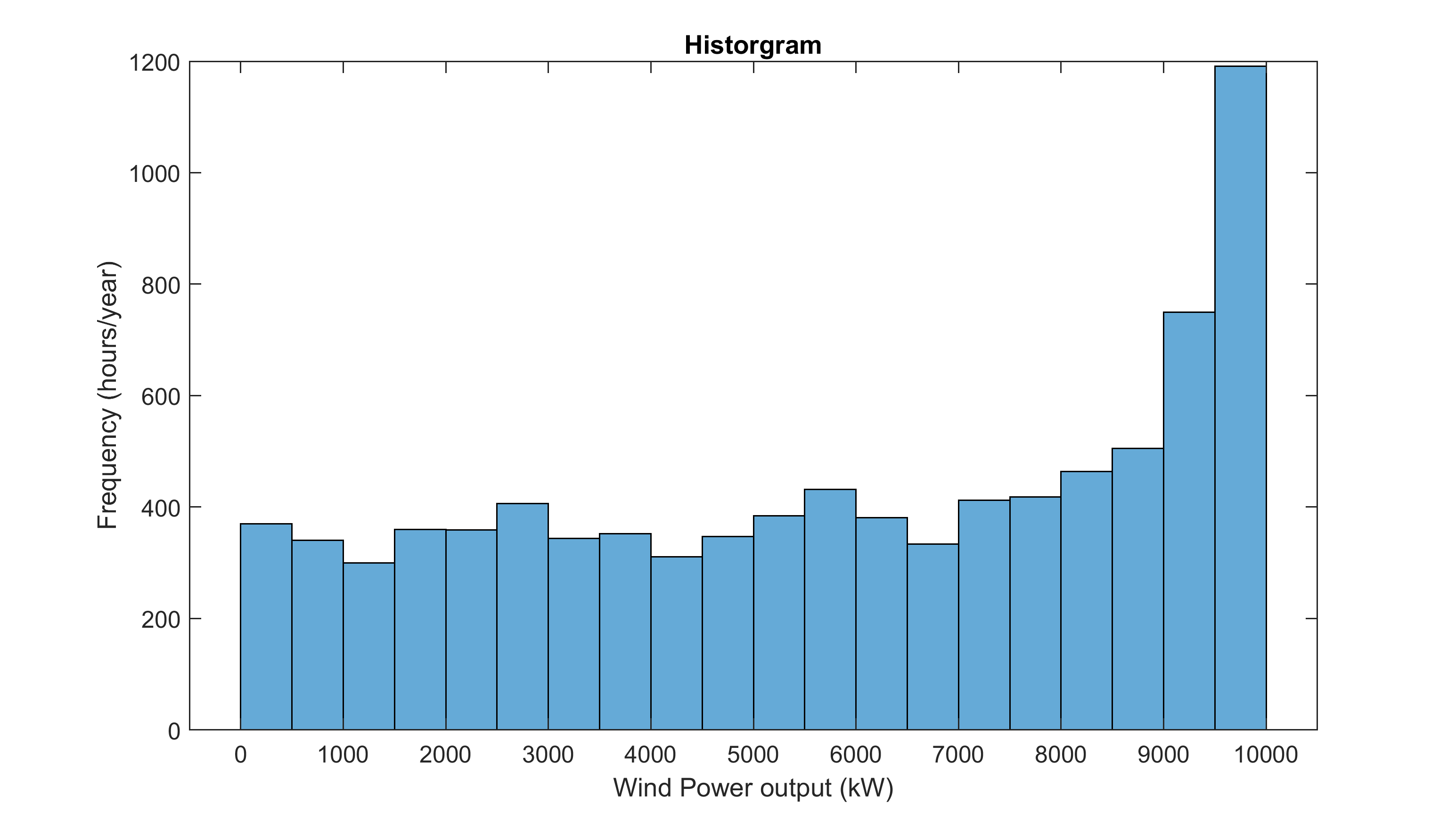
I have been collecting data directly from the web-app from North Sea locations and I found all of them give a strange power output as you can see below. The locations are in the Dogger Bank area (coordinates: 54.7500N 1.9167W and 54.9902N 4.7900W).
Should the histogram instead show a peak in the low-end power rating and one in the higher-end (caused by cut-in and cut-out speeds)?
Can the output of one specific coordinates in the map be used together with the capacity factors per country from the Renewables Ninja v1.1 data set?

Source: 54.75N 1.9167W, year 2010, Power: 10000kW, Vestas V90 2000 or Siemens SWT 4.0.